Hershey Text is an Inkscape extension that can render a line of text in one of several stroke-based "engraving" fonts. This extension solves a persistent problem, and one which we have come across in many different contexts: How to easily create simple and readable vector representations of text.
Quick start: Download the latest version of this extension here, and install it like a regular Inkscape extension. Much more information follows.
Huh? What's this all about? Why are you doing this?
It's kind of a long story. But it goes to the heart of who we are and what we're doing.
Neither the problem nor the fundamental solution are new. Creating simple representations of text was an important problem in early computer graphics, for both vector displays and pen plotters. Good solutions-- sets of "engraving" fonts --were developed. But then along came "outline" fonts, dot matrix monitors, high-resolution printers and personal computers. And that was that.
Thirty years later, low-cost and easily available computer-controlled manufacturing tools have created an exciting realm for exploration that's even open to most hobbyists: Laser engravers, 3D printers, CNC routers, vinyl cutters, embroidery machines, (yes) pen plotters. If you design for any of these on a regular basis, you're likely to come across a case where you'd like to efficiently create some readable text with your tool, and "engraving" fonts are often the best choice. For this very reason, many professional-level CAD tools include some form of engraving font.
The trouble is, many CAD pagages and most illustration packages (including our favorite, Inkscape) do not come with engraving font support, because it's such a specialized requirement. We'd like to fix that.
Outline fonts versus Engraving fonts
We've mentioned outline fonts and engraving fonts, but let's clear on these. Most modern font systems (truetype, postscript, opentype, etc.) are examples of outline fonts. In these, the font file describes a filled vector shape. That is to say, the visible part of a character in an outline font is the area enclosed by the shape. Fonts like these are appropriate for use in laser printers or other high-resolution devices. By contrast, an engraving font (sometimes called a "stroke" font) is one where each visible character is defined by the stroke itself, not the area enclosed by it. Fonts like these are appropriate for pen plotters, machine tools, and other circumstances where the pen width itself is significant.
Here are examples of text written in an outline font versus written in engraving font:
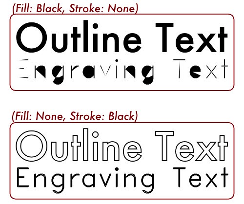
In the upper box, both lines of text are drawn with a solid black fill, and no stroke (outline). The outline font is legible; it looks as it is intended.
The engraving font is basically illegible, since the enclosed area is not meaningful. In the lower box, both lines of text are drawn without any color fill, but instead with a solid black stroke. This renders the engraving text correctly.
Now, there's a time and place for both types of font face.
Outline fonts are perfect for use with high-resolution raster imaging devices, like LCD screens and laser printers. In these cases there's no significant penalty for filling in large regions.
But, if you use any of the physical fabrication methods that we've already mentioned, then there is usually a significant time cost to filling in large regions. For example with a pen plotter, it's much faster to draw the outline of the engraving font than to raster back and forth to fill in the entire outline font area. The higher the pen resolution (the smaller the tip), the slower it will be. The same goes for text areas cut with a milling cutter on a CNC machine, certain types of laser-engraving, embroidery machines, and so on.
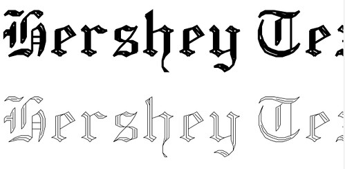
A second reason (besides speed) to use engraving fonts with physical fabrication is that the tool size is often significant. The tool size could be the pen width (for a plotter), the cutter width for a milling machine, or the thread width for embroidery. You certainly can use an outline font and just trace its outline, but that can create legibility issues, especially if your tool is wide. By contrast, engraving fonts rely on the tool width to create the legibility. In the example above (shown with and without a realistic thick pen stroke), it is the pen width that creates the intended character.
Other examples where we've come across good uses for engraving fonts include production laser engraving (where a single-stroke font lead to a huge speedup), printed circuit board design, where the minimum silkscreen and copper widths led to better looking graphics when we used engraving fonts, extrusion-based 2D and 3D printers (including cake decorators and MakerBot), and genuine pen plotting with 2D machines and the EggBot.
Getting and Installing the extension
Download the latest version of this extension here. You will need to have a recent copy* of Inkscape installed as well.
The easiest way to install them is to simply copy the three files from the ZIP file into your Inkscape extensions directory. Depending on your operating system, this file is usually located in one of the following directories:
Windows: C:Program Files>Inkscape>share>extensions
Linux: "/usr/share/inkscape/extensions"
OS X: "/Applications/Inkscape.app/Contents/Resources/extensions"
Once you copy the files into that folder, restart Inkscape.
*Special note for MacOS 10.6 users: Use Inkscape 0.48.1 or newer, or install the Eggbot extensions for Inkscape.
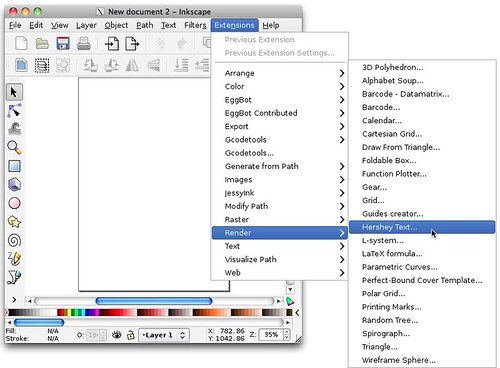
If the Hershey Text extension is installed correctly, it will show up in the "Render" submenu of the Extensions menu in Inkscape.
Using the extension: Rendering text
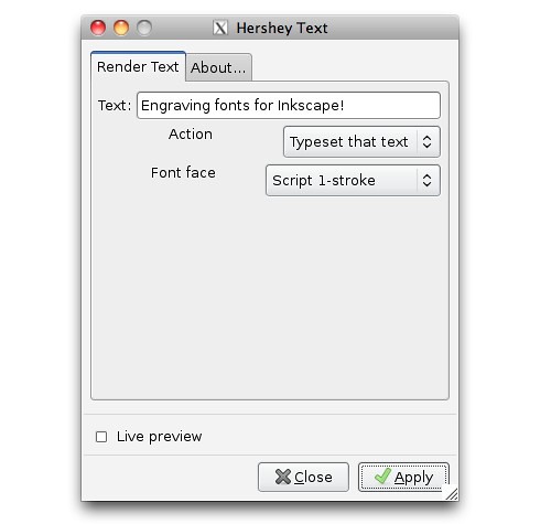
To create a line of text, type your text into the box. Make sure that "Typeset that text" is selected as the "action," select your font face, and click "apply."
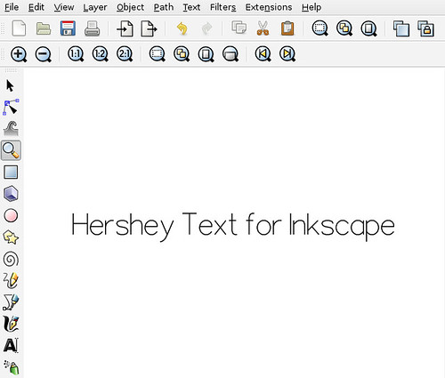
If all goes well, the line of text that you've entered will appear on your drawing. The line of text shows up as a group of path objects. The text is rendered as a drawing, not as editable text. You can resize and move the text object as you see fit. You can also use all of the usual path manipulation tools to edit the shapes within Inkscape.
Using the extension: Glyph tables
The fonts included with the extension are a classic set of Hershey fonts, spanning normal keyboard characters. While many of the characters are straightforward to locate, others-- particularly obscure symbols -- don't have a clear keyboard mapping. The extension has a mode to create a glyph chart, to help you locate and type interesting symbols.
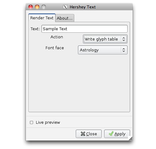
To use the glyph table, make sure that "Write glyph table" is selected as the "action," select your font face, and click "apply."
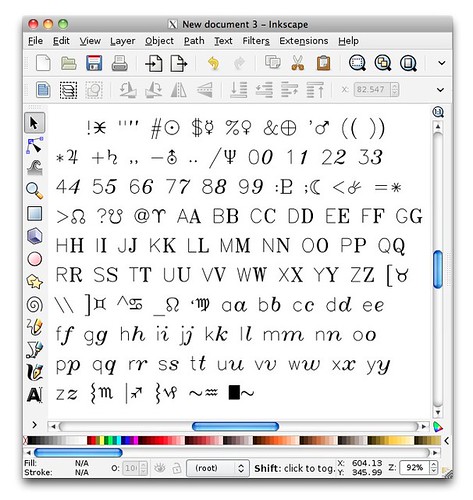
Here's a typical result. The table contains a pair of characters for each symbol in the font face. The left symbol is the "standard" keyboard character-- as rendered in the single-stroke sans font -- and the right symbol is the corresponding glyph from the selected font face.
Using the extension: Fonts and name conventions
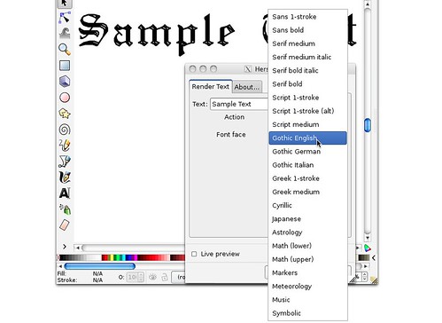
The extension contains a selection of more than 20 font faces.
We have modernized several of the font names, to reflect conventions developed in recent years, and strictly for reasons of clarity. Instead of "Roman Simplex" and "Roman Complex", we've used terms like "Sans," and "Serif." Likewise, rather than "Simplex," "Duplex," and "Triplex," we've used the terms "1-stroke," "medium," and "bold" -- reflecting one, two, or three-stroke wide characters.
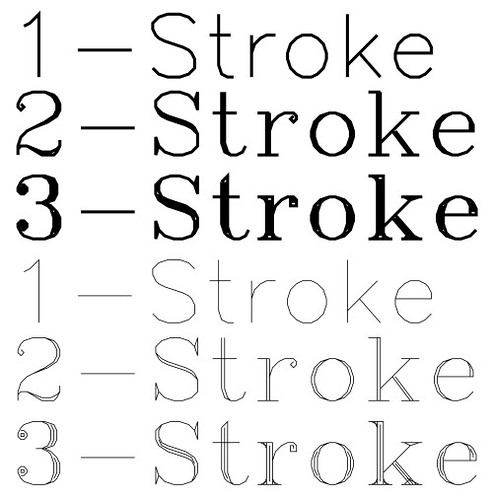
Single-stroke fonts have but a single pass through each major section of each character. The wider fonts fill in as needed to create the correct medium or bold appearance.
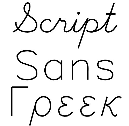
Three of the font faces are true single-stroke fonts that are extremely efficient for machining operations:
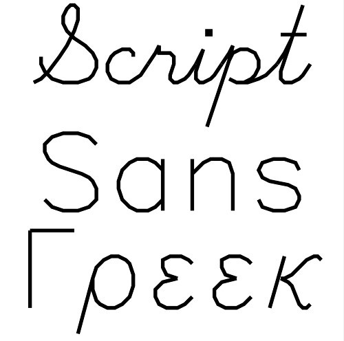
Those are, "Sans 1-stroke," "Script 1-stroke," and "Greek 1-stroke."
Smoothing the characters
You may notice that the drawing above seems a bit "jerky." that's because these fonts are made of straight line segments. And, this is actually the full resolution of the original font design.
You may find it convenient to simplify the paths to create a smother shape.
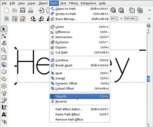
To do so, select the Hershey Text object that you wish to smooth, and select Path>Simplify from the menu.
Having done so, here is the result: Smoother text.
About Hershey and his fonts
The engraving typefaces built into our Inkscape extension have been around for quite some time. They are a subset of those designed by Dr. A. V. Hershey while working for the US government in the 1960's, and then widely disseminated by the US National Bureau of Standards in the 1970's, in "Tables of Coordinates for Hershey's Repertory of Occidental Type Fonts and Graphic Symbols."
They are now generally considered to be in the public domain.
The complete Hershey library contains thousands of characters in many languages. Each symbol is composed solely of straight lines, and is defined individually through a "moveto/lineto" kind script. You can read more about the Hershey fonts here and here.
Special thanks to Marty McGuire for motivating this with his SVG Hershey Font collection and to Dan Newman for additional test and symbol verification.
remote computer repair on site pc repair computer hardware repair
OMG great tutorial…very simple but outstanding Very helpful in designing very nice tut…i
回复删除hope I’ll get the same result.pcb assembly uk ,pcb suppliers